Airtel — UI Library
2016 — 2017
User Interface & Content Design
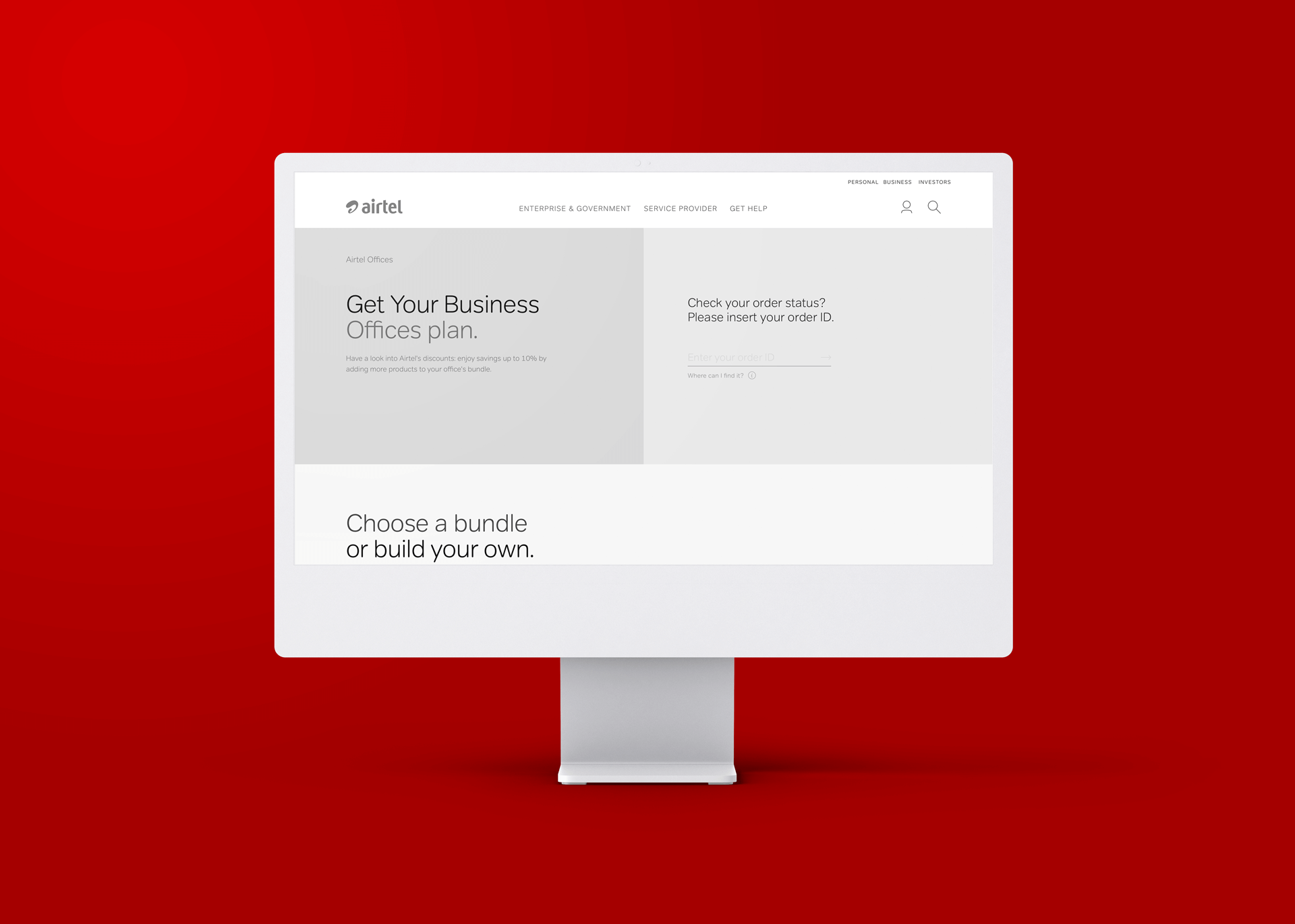
We have multiple Airtel products and services to deliver impressive customer experiences. However, we needed help maintaining consistency between the B2C and B2B platforms. To address this challenge, we initiated a project to design a component library to accelerate the building process for our design and development teams.

Challenge
We had two major issues. Firstly, our workflow could have been faster because we were not using components as symbols, which made it impossible to save and reuse common elements across our designs. Secondly, every time we made changes, it had to be done screen by screen, which resulted in much extra work. The same problem was also happening with our dev team.
Methodology
We started by analysing the overall aesthetic and identifying the most effective patterns to show each component to achieve our goal. Once done, we created a library with nested symbols and a documentation file, which includes all relevant features and information for both the design and dev teams. Finally, we hand over the files to the devs so that they can build their code sandbox.
Colours
The colour scheme of any system plays a vital role in providing a seamless experience to its users. The primary colours are the system's building blocks, while the neutral colours provide a balanced and harmonious look. The purple colour adds a touch of sophistication and elegance to the overall design. Additionally, secondary colours enhance the user's experience by providing sufficient contrast and improving usability. A well-thought-out colour scheme ensures a visually appealing and user-friendly platform.

Grids
A Layout Grid is a system that outlines the design structure of a webpage, consisting of breakpoints, margins, columns, and gutters. These elements create a visual hierarchy, ensuring a consistent, well-defined layout that guides creative decisions. This approach not only enhances the visual appeal of a design but also improves its functionality and usability.

Text-styles
Fonts play a crucial role in creating visually appealing designs. They are available in different sizes to help you establish a clear information hierarchy and ensure that designs are easy to read and understand across various contexts. By carefully selecting the appropriate font size, you can create a harmonious and balanced composition and effectively convey your message to your audience.

Icons
Icons are graphical symbols that convey meaning and represent various actions, states, and data categories. They are essential to visual communication, providing a visual context that enhances usability and user experience. Icons are widely used in web design, mobile apps, and other digital platforms to improve the user interface and make it more intuitive and user-friendly.
Components
Components are the essential building blocks of any design library. The user interface (UI) elements enable users to interact with the page. They are the heart and soul of any library, providing the visual representation and making it easy for the users to use effectively.
Badges

Pagination

Tags

Tooltips

Patterns
Design patterns refer to reusable solutions that help solve common design problems. They consist of components, such as user interface elements, design elements, and interaction flows, that work together to address user objectives. By using design patterns, designers can save time and effort by not creating these solutions from scratch. Instead, they can rely on tried-and-tested approaches that have proven effective in solving common design problems.
Bar Charts

Pagination

Skinny Banners

Step-tracker
Outcome
In 2016, Design Systems had yet to become a popular conception, and Zeplin, a handoff tool, was still in its early stages. As a result, we had to rely on the resources available to us at the time to create design files that were chock-full of dimensions, variations, guidelines, and CSS annotations for both the design and development teams. It was daunting and challenging, but seeing that our efforts paid off in speeding up the building process and improving consistency was incredibly satisfying.
Collaborated with a talented group of individuals at CSG Experiences Practice - Gen Design Studio :)
Browse more work
© 2022 Cristiano Loureiro All Rights Reserved.