Currys — Bits & bobs
2019 — Present
Product design
Currys is a leading retailer of technology products and services with an online presence and 829 stores across the UK & Ireland, Nordics, and Greece. As a product designer for the Basket, Checkout, and Payments section, I have been responsible for the entire journey since I joined in 2019. Working in a fast-paced agile team, I have solved various problems and challenges along the way.
Challenge
Our focus is improving the user experience, making the shopping journey more seamless, and ensuring that every design solution aligns with accessibility guidelines. Additionally, it's imperative to establish clear KPIs around the customer experience. We aim to use data-driven solutions to continually improve and optimise our digital experiences. By doing so, we plan to drive the conversion rate and ensure our customers have the best possible experience on our digital platform.
Methodology
Analytics & Insights
It involves collecting and interpreting data to understand how customers interact with the site and their actions. This information can help us make informed decisions on improving user experience.
User Experience audit
We identify and address any issues users face while interacting with our product by conducting an audit. It also helps discover opportunities for improvement to enhance the overall user experience.
Task/Project Scope
We will discuss and clarify the project's scope and prioritise the various features based on their level of urgency and impact on the project's success. This will help us stay focused and achieve the same goals and objectives.
Design
Create wireframes, visual designs and prototypes to validate the concept. Conduct user testing to ensure usability and perform AB testing. This gurantee the final product meets the needs and expectations of the users.
Radio buttons
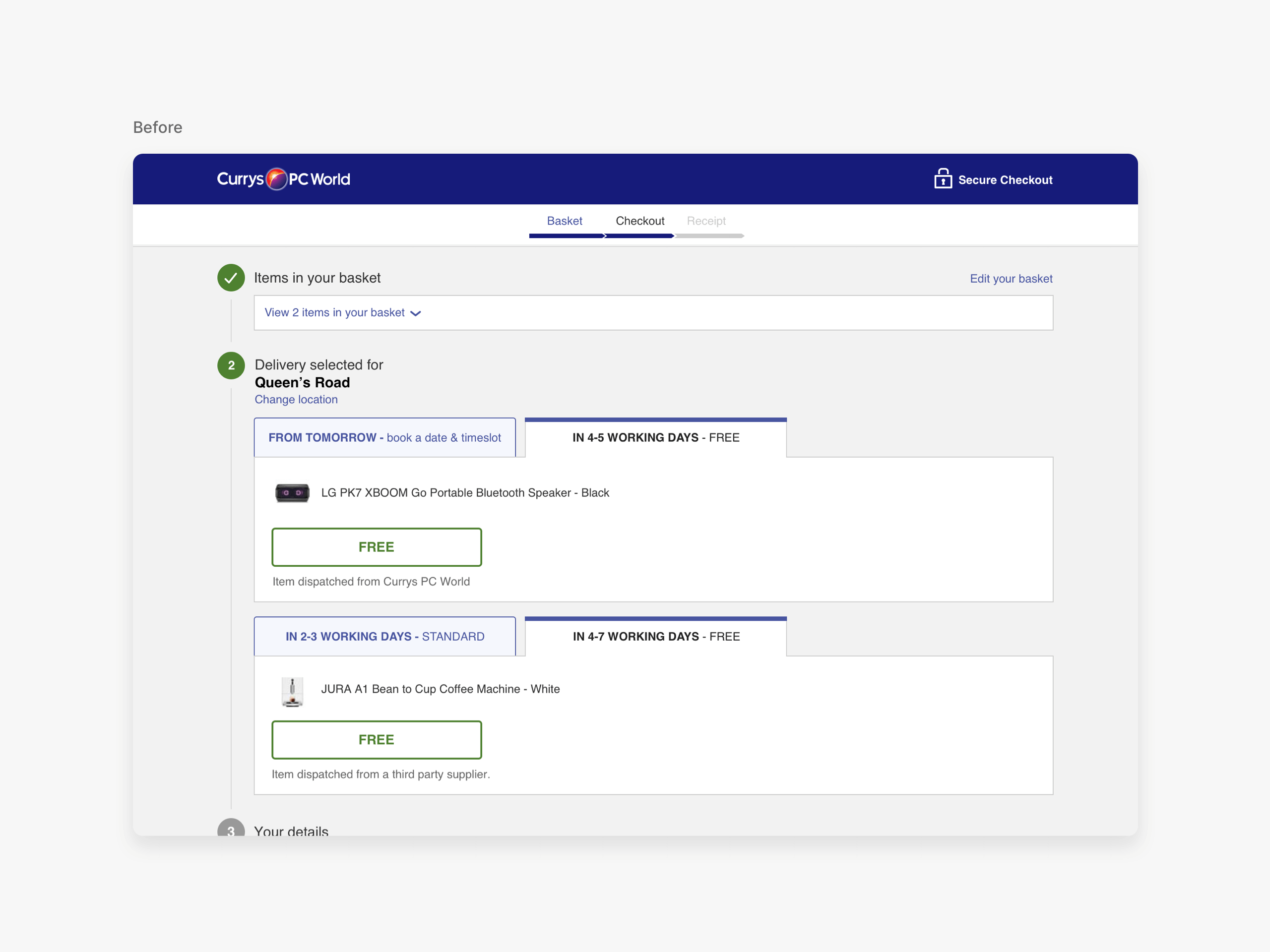
Problem
The delivery details section on the website needs to be fixed. Upon observation, it was found that there are a few things that need improvement:
• The presence of tabs to switch between delivery options makes it confusing for users to understand which one they have selected.
• No confirmation button is available to proceed to the next step, making it difficult for users to confirm their selection.
• The upfront price for premium delivery must be displayed. Otherwise, it can confuse and frustrate users.
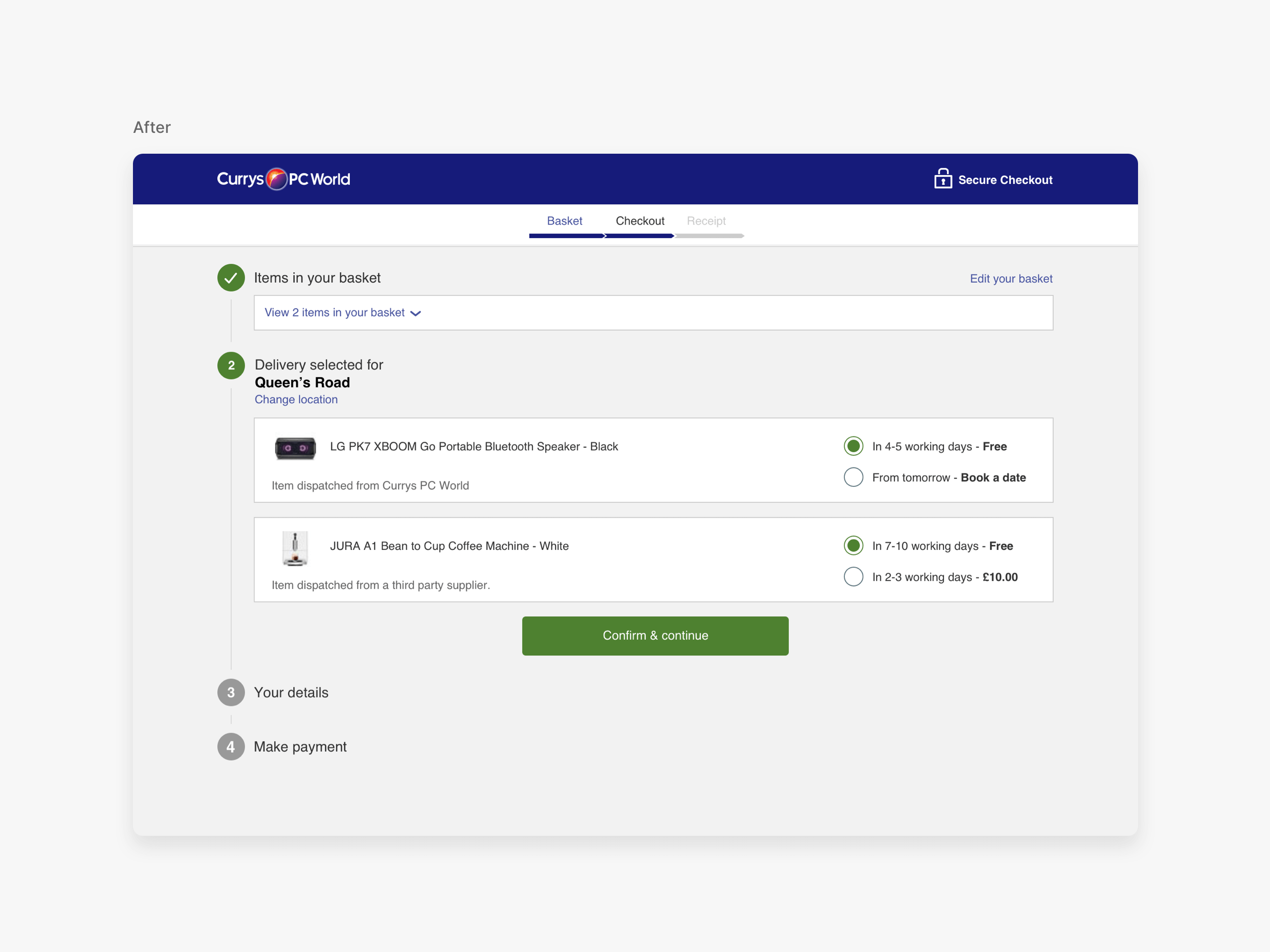
Assumption
We are redesigning the interface using radio buttons. Radio buttons present options clearly and intuitively. This will make it easier for the user to navigate and interact with the interface. A confirmation button has also been added to proceed to the next step.


Usability test results
• Net Promoter Score (NPS) of 60
• Time taken to complete the task reduced by 40 seconds and required 2 clicks less to succeed
• Majority of the participants preferred the new solution
• One participant reported, "I find it easy to locate and click. The tabs are kinda not that clear."
Implementation outcome
• 11,47% uplift in Conversion Rate
• 21,32% increase in Revenue Per Visitor
• 37% drop in Checkout Abandonment Rate
Premium slots
Problem
It was noticed that the availability of weekly premium delivery slots could be more easily visible during the checkout process. This may cause inconvenience to customers who want to choose a delivery slot while placing their order.
Assumption
We propose to enhance the calendar viewing, providing a broad view of the entire week and allowing users to easily view the available time slots for the day they have selected. This will enable users to compare delivery prices more effectively.


Usability test results
• Net Promoter Score (NPS) of 70
• On a scale of 1 to 7, with 1 being difficult and 7 being easy, 86% of participants chose the score of 7
• All the participants preferred the new solution
• One participant reported, "Seemed straightforward and intuitive, very easy to use!"
Implementation outcome
• 8,21% uplift in Conversion Rate
• 19,15% increase in Revenue Per Visitor
• 17% drop in Checkout Abandonment Rate
Fulfilment options
Problem
Customers who order on an e-commerce website are typically presented with fulfilment options such as delivery or collection. It is common practice to request their postcode during this selection process. However, the fulfilment selection is on the Basket, while the postcode input field is on the Checkout. If a particular fulfilment method is unavailable at their location, customers may have to navigate back and forth between the two pages to switch to the available option. This can be quite frustrating and leading to significant dropoffs.
Assumption
To avoid confusion, adding the postcode check to the same page as the fulfilment selection is recommended.
Old behaviour
The main problem is that the fulfilment method selection is on Basket, and postcode selection is shown in the next step.

The user can only switch the fulfilment method by clicking the "Edit" link in the top right corner, redirecting them to the Basket page, resulting in an inconvenient experience.


New solution
Customers can now check delivery/collection availability by entering their postcode without committing to a final decision at the basket.

We have grouped all fulfilment options for the convenience of the customer. If customers need to change their preferred fulfilment method or update their postcode, they can do so easily and quickly.

Usability test results
• Net Promoter Score (NPS) of 67
• Time taken to complete the task reduced by 1 minute and 40 seconds
• All the participants preferred the new solution
• One participant reported, "Because it's easier and simpler"
Implementation outcome
• 16,12% uplift in Conversion Rate
• 28,67% increase in Revenue Per Visitor
• 34% drop in Checkout Abandonment Rate
Store collection
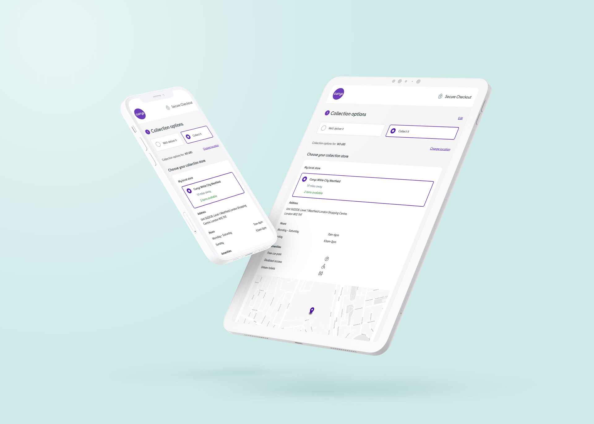
Problem
This page has two significant issues that need attention. Firstly, the number of stores in the folder could be higher than expected, which may impact the user's ability to find their desired store. Secondly, there needs to be more information regarding the stores themselves, which could leave users with unanswered questions about the store's services or location.
Assumption
Improve the user interface to accommodate more stores on the folder more effectively. Furthermore, including maps and information about amenities such as restrooms, parking, and disabled access would significantly enhance the overall shopping experience for users.

Previous look and feel
It's not possible to fit more than one store on the fold due to the large size of the UI.
Improved experience
The new design allows us to accommodate four stores on the fold, whereas the previous design could only fit one.


User test results
• Net Promoter Score (NPS) of 80
• All the participants preferred the new solution
• One participant reported, "Super handy information"
Implementation outcome
• 6,96% uplift in Conversion Rate
• 13,31% increase in Revenue Per Visitor
• 14,27% drop in Checkout Abandonment Rate
Browse more work
© 2022 Cristiano Loureiro All Rights Reserved.