Deutsche Telekom — Design System
2018 — 2019
User Interface & Content Design
Deutsche Telekom is a globally renowned company in communication and information technology. They aim to convert their customers into loyal fans. To achieve this, they continuously invest in improving user experience, making digital life accessible to more and more customers. As part of this initiative, we developed a design system to ensure a uniform design language for their B2C e-commerce platform.
Challenge
Deutsche Telekom is an expanding global organisation that requires a system capable of handling constant growth. The main goal was to improve team collaboration and accelerate the building process.
Methodology
This Design System is based on the Atomic Design methodology developed by Brad Frost. The method involves breaking down a website's fundamental building blocks or components. These components can then be reused across the website to ensure consistency in design and functionality. This approach enables designers and devs to work more efficiently and effectively to create a cohesive and user-friendly website.
Colours
Colour is a crucial element in creating a unique and consistent corporate identity. We can categorise colours into three groups in this palette. Magenta is used to strengthen the brand through the product. Grey is the most commonly used colour in various combinations to provide an elegant and cohesive visual. Feedback colours are used to convey alert messages to the user.

Grids
Media queries play an essential role in determining the optimal user experience by defining specific points (known as breakpoints) where the layout of a webpage changes to adapt to various resolutions or devices. These breakpoints are established by analysing the most commonly used solutions, ensuring the design is optimised for the broadest possible audience.

Text-styles
To convey a message clearly, it is essential to prioritise the information presented. To achieve this, the typography used in the product is divided into sections, paragraphs, and titles. The titles are arranged according to their significance, making it easier for the reader to understand the content. Properly structured titles and body text ensure a seamless reading experience.

Icons
Icons are intentionally designed with simplicity, modernity, and friendliness in mind while still being coherent. Each icon is minimised to its essential characteristics to achieve a minimal form. These icons are scalable, which allows designers to use them in various sizes to cater to the needs of each page.
Elements
Elements are groups of UI elements that function together as a unit, serving a purpose. Creating simple UI elements makes testing more accessible, encourages reusability, and promotes consistency throughout the interface.

Modules
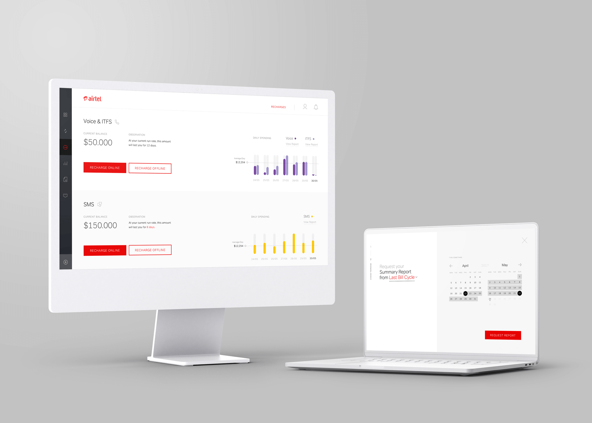
Modules are UI components consisting of various groups of elements and underlying foundations with distinct attributes and functions. For instance, a header module may include elements such as a logo, a primary navigation list, and a search form. These organisms are present on almost every website we come across.

Outcome
Design systems allow designers and devs to break down website elements into smaller parts that can be used independently. This means that different portions of the website can be identified and reused or paired with other elements to create new modules. As a result, there are fewer components, and the platforms are more consistent. Click here to view the library developed from scratch in React.
Colaboration with Adriana Correira (PM) Carlos Amaral (Designer), Joel Araújo (Designer), Andreia Tenreiro (Designer)
Browse more work
© 2022 Cristiano Loureiro All Rights Reserved.