Currys — Omnichannel
2019 — Present
Product design
Omnichannel refers to integrating all channels, whether physical stores or online platforms, to provide customers with a seamless shopping experience. It is not just about giving customers the option of choosing between a physical store or an online platform. Instead, it is about providing a unified and cohesive experience across all channels.
Challenge
Our website has an exciting new vision, and making it a reality for our customers is essential. By improving the website's functionality and user experience, we aim to create a shopping environment that is both enjoyable and efficient. Our goal is to provide our customers with the best possible experience so they choose to shop with us repeatedly.
Methodology
To ensure a seamless shopping experience for customers, it's essential to stay updated with the latest design trends, analyse customer feedback, and monitor what competitors are doing. Additionally, conducting usability studies and user research can provide valuable insights into customers' wants and needs. I also took the initiative to submit ideas for A/B testing, which can help identify the most effective strategies for improving the customer experience. Combining these efforts, we delivered clear, uncomplicated experiences and made shopping easy for our customers.
Design evolution
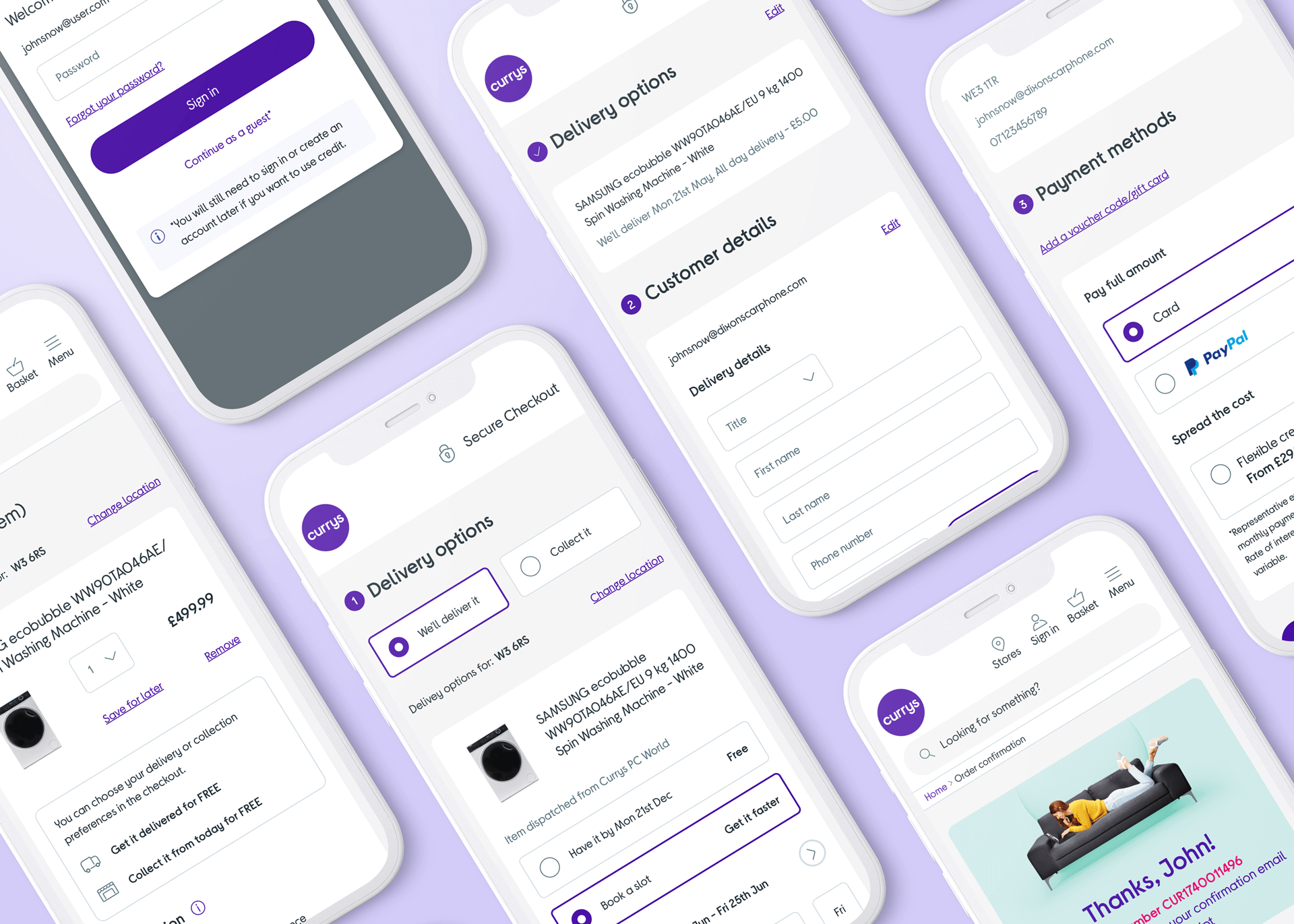
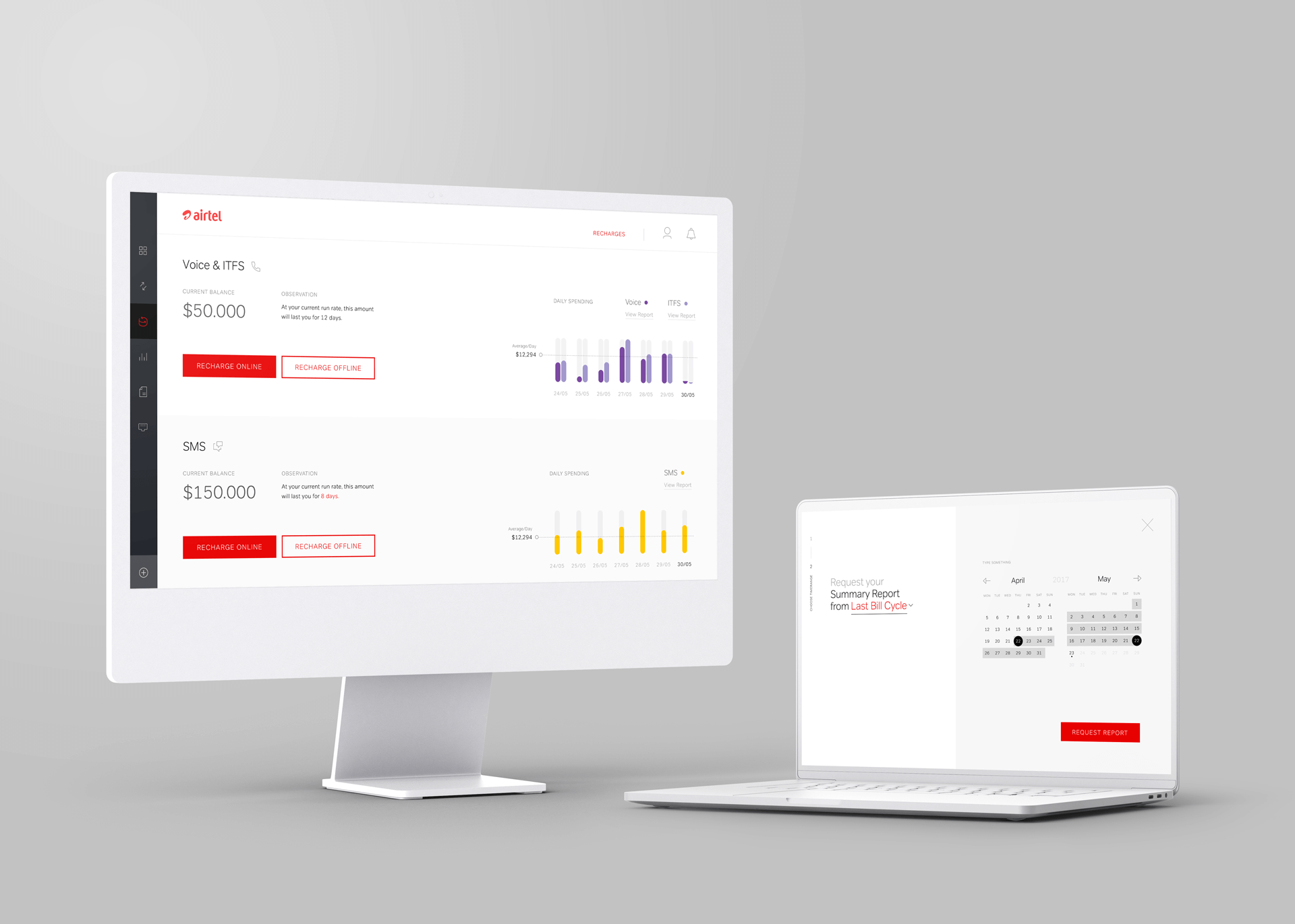
Throughout my years at Currys, the Basket, Checkout, and Payments sections have undergone significant changes. Each iteration has been crafted by building on the lessons learned from the previous version. The final version of these sections was created through design and innovation to provide a seamless and intuitive user experience. Now, the shopping process is easier and more efficient for customers.

1. Old Checkout

2. New Checkout

3. New Checkout - Reskin

4. Omni - future world
High-level user journey
The checkout flow is straightforward, and its behaviour remains consistent across different websites. The main goal of this project was to re-platform the existing website and enhance the user interface significantly. We also implemented logical changes based on the latest industry standards and guidelines. One noteworthy change we made was to move the account selection/creation functionality to be positioned before the checkout process. This modification improves the overall user experience and ensures a seamless transaction process.

Wireframes
Although the design flow mainly remained unchanged, some minor modifications were made to the page layouts, information hierarchy, and interactions. These changes were aimed at enhancing the overall user experience of the design. Wireframes were crucial in exploring and experimenting with different design possibilities and addressing design issues.


Designs
After investing six months in this project, I am proud to share the final outcome with you. The user experience for Basket and Checkout has been significantly enhanced, making it more intuitive and user-friendly. Customers can now enjoy a seamless shopping experience with fewer obstacles and more streamlined processes. The improved design and functionality undoubtedly increased customer satisfaction and loyalty.


Outcome
We improved our customers' shopping experience by keeping up with the latest design trends, analysing feedback, and monitoring our competitors. Usability studies and user research helped us gain valuable insights into our target audience. We also conducted proactive A/B testing to identify effective strategies. As a result, we streamlined the shopping process, strengthened our brand, and promoted greater customer satisfaction. We'll continue using data-driven and user-centred methodologies to ensure seamless customer experiences.
I want to give a big shout-out to Edward Harling, the Project Owner, and Jonas Baranauskas, the Manager.
Browse more work
© 2022 Cristiano Loureiro All Rights Reserved.